TWENTY·THOUSAND:To mark the 20,000th issue of the daily newspaper “Trouw”, Niessen & de Vries were asked to design a special cover for the newspaper to commemorate this occasion.
WRAP:The number 20,000 is printed across the front and back of the newspaper. The word “Number”, set in Frutiger to represent the current identity of Trouw and the old Trouw identity is laid out in a cross formation to signify the journey from the past, present and to the future. This is over laid on the 20,000. Colourful patterns were used to abstract the typography to create a dynamic and striking cover.
STEDELIJK:the cover of this annual report consists of nine illuminated characters: S; T; E; D; E; L; I; J and K, printed in silver on a blue canvas, these characters come back as chapter dividers inside the book.
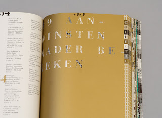
DEPARTMENTS:the Stedelijk Museum Amsterdam consists of nine departments (collectie; smba; smcs op 11; educatie; p&o; nieuwbouw; tentoonstellingen; publicaties; begunstigers) and therefore the book has nine chapters as well. Each of the departments has its own geometric pattern printed on the outer margins and the first illuminated page of its chapter.
ILLUMINATIONS:in mediaeval manuscripts, illustrated capitals (illuminations) are used at the beginning of each chapter; the titling in this annual report, printed in gold and using different patterns, refers to this tradition of illumination


No comments:
Post a Comment