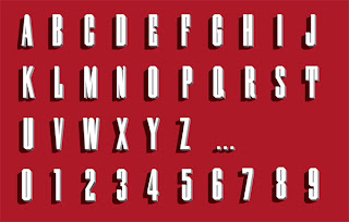
A typeface designed for Wired. Used throughout the magazine and iPad app for chapter headers the typeface can be coloured in numerous ways in order to suit the page it sits on.
Showing posts with label Type Design. Show all posts
Showing posts with label Type Design. Show all posts
Monday, 9 January 2012
Tuesday, 20 December 2011
Nomed Font by Medness
I really love this.
From the use of still simply triangular shapes which on its own wouldnt necessarily be that interesting but the way the designer also using lines that give it movements and playing with the scales for the difference purposes and different media.
The use of colour is also really efective in terms of bringing the shapes together
The typeface is really abstract and not necessarily that readable but I don't think that that would be an issue, its the overall branding that really works together as a whole
Subscribe to:
Posts (Atom)


