Showing posts with label Brief 4 : South East Of Here DC. Show all posts

Monday, 21 May 2012

BAO BEI CHINESE BRASSERIE

http://www.glasfurdandwalker.com/

The brief was to create a memorable and distinctive identity and brand design for the restaurant Bao Bei Chinese Brasserie in Vancouver’s Chinatown. 

Inspired by old Shanghai, the restaurant and its identity was to feel naturally Chinese - not heavily ‘themed’ and bring together elements of contemporary design with historical nuances that serve to infuse the
brand and space with a distinctive persona and atmosphere. 

The identity and collateral was to feel diverse and
varied with elements that the diners could discover as they interacted with each piece.

Visit www.bao-bei.ca.


Burlap Restaurant Branding


The people at Bex Brands have done a wonderful job of branding and marketing Burlap, a restaurant in Del Mar, California. The brand is lively and full of layers of illustrations and strong colors based on a rouge. The typography is classic and well used. The entire concept is “Asian Cowboy” which is how it’s described and exactly how it looks.


Pastis A neighborhood goes from escorts to escargot.


CHALLENGE

When client Keith McNally decided to open a French bistro in the now trendy Meatpacking District of Manhattan, the area was anything but chic. In fact, in 1997 it was virtually deserted. But he asked us to help make his vision of an authentic working-class bistro come to life, and to create a dining destination out of a neighborhood better known for meat lockers than beouf bourguignon.

ACTION

The famous Pastis logo was designed to convey the authentic feel of an old-style local French eatery. It changes slightly according to different uses in order to give the effect of a brand that has grown and evolved over time. The Mucca team designed a set of four distinct custom typefaces to be used in support of the brand across an array of printed pieces. A crucial element of the identity was the exterior signage; it needed to attract attention to a neglected street corner with little traffic, yet blend into its weathered and gritty surroundings. Authentic enamel drink menus tempt passersby with vintage cocktails, while the rough-looking, faded lettering on the façade, juxtaposed with iconic red awnings over the outdoor tables, suggest that the place has a history, and invites others to be part of it.

RESULTS

Another one of Keith McNally’s hugely successful landmark restaurants, Pastis is a familiar setting for celebrities, sophisticates, and ordinary folks alike. Its lasting success is a testament to the power of the the proprietor’s vision and the brand identity that established it as a beacon for like-minded restaurateurs to follow.


Palomino Restaurant Branding


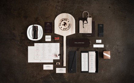
What’s most impressive about the brand identity for Palomino restaurant is the printing and finishing techniques used throughout the printed pieces. Printing is an expense and increasing it for the sake of beauty is hard to justify. However, the use of embossing, debossing, stamps and other printing techniques makes this so unique and interesting. Great work by Super Big Creative.

Thai restaurants in the UK

Generally, nor very well designed or aesthetically interesting. just quote samey and very 'THAI'

I havent really been able to find any  high end thai restaurant that have any kind of design that I like on their branding


Wednesday, 2 May 2012

Poly (studio) : Zoo Exhibition


Poly: Zoo Exhibition

Zoo is a show curated by the hus­band and wife team of Jacqui Oakley and Jamie Lawson, which fea­tured “a col­lec­tion of smaller paint­ings and arti­facts brought together in one space along­side mod­er­ately inter­ac­tive pieces” as well as “larger works fea­tur­ing the col­lab­o­ra­tions between par­tic­i­pat­ing artists.” All of the graph­ics and mate­ri­als for the show were designed by Jamie and his design stu­dio Poly.


Wednesday, 29 February 2012

Roundhay Concept

I need to start designing something. I've got some really basic concepts but Im really struggling with coming up with a strong concept.

I'm trying not to start designing logo because thats just not the whole identity but I might have to. 

the general concern is I want to make it fun and not like a typical  'park' image as they are really boring. 
I want it to be  now and young. 

Also, need to not think about the promotion yet as I've split the briefs into two parts really, the branding and the promotion,....but I dont know whether I should be thinking about them simultaneously  ? I just feel like I'm thinking about too many things at the same time.


Thursday, 9 February 2012

Miller Creative

http://www.yaelmiller.com/

Finally! A graphic design studio that mainly does food branding....

some of the stuff isn't really muy style but there are still some really lovely stuff that I prefer.

This will actually inspire me to look for studios that may be more focused on food and not just general branidng