- João pé de Feijão
Jack and the Beanstalk - Merchandising developed around the "Jack and the Beanstalk" tale and made through a college project, the briefing asked us to use this tale and create a set of merchandising items.
My objective was to design a product based on the tale with the product being 5 magic beans, a wide range of merchandising was created to support the product, including the packaging and a set of mail stamps.
The main package includes the vase, the magic beans and the instructions.
www.onrepeat.net


 What I like :The typography combinationThe publication to promote this brand of nuts'and this style in general where the type arent necessarily all really clean but the way everything is layout and stacked are.the layout of the publication is also quite interesting, theres a sense of structure there but at the same time its almost illustrative and decorative.The layout varies quiet a lot but doesn't look scattered or all over the placeAlso I really like all the individual typefaces used for this

Tuesday 20 December 2011
João pé de Feijão


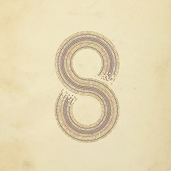
Nomed Font by Medness


I really love this.
From the use of still simply triangular shapes which on its own wouldnt necessarily be that interesting but the way the designer also using lines that give it movements and playing with the scales for the difference purposes and different media.
The use of colour is also really efective in terms of bringing the shapes together
The typeface is really abstract and not necessarily that readable but I don't think that that would be an issue, its the overall branding that really works together as a whole


Historia - Programmation d'automne
- - -
A simple project, sent to journalists and communication people to announce the new autumn tv schedule for Historia. The envelope contains a poster, inspired by old wood press posters. On the other side, we can find a detailed description of each show. The title «En vedette» is a custom font.
- - -18"x24"Tirage de 500 copies - Cougar blanc naturelNoir + Pantone 1807
Merci à Mélanie Sylvestre et Anne-Claire Lefaivre!


Just a really nice bit of printed and mail outs. Nice clean bold type.
really really
Also I like the way the work is photographed with the wooden and brick backgrounds rather than just photographing in the studio
I really like the dim red colours on the beige textured paper
Monday 19 December 2011
People Collective


This is more to do with promotional design and publication. I really like the simple layout in the two pieces of prints above and also the use of colours. It is not hugely experiment but they just look really well done and just look nic ein general
quite clean and modern
the ones at the top are more decorative but the layout still has a structure to it, it is the individual type that us is more illustrative
David Whitley


These are just some examples of Whitley's work but I basically want my work to look like this
I like the way he uses colours and really simple typography
Also the use of geometry and pattern to create a typographic piece of work.
I just generally like his style of work and I think with the subject matters of his project, this is very appripriate


The simple geometric illustrations on textured coloured paper background is really lovely
These are more like pieces of artwork than design but the style is what I would want to take from this designer
Resourceful. Nature as a model for the design.
"Put" perfection, natural beauties and perfection of our people in awe. You
are the pure fascination. Designers are always looking for brilliant ideas, one-
case-rich solutions and innovative implementations. They are looking for new sources
of inspiration, this is the biggest resource .. directly in front of us, the nature offers
. an infinite variety of design
, the book my personal confrontation shows with nature as the absolute
source of inspiration, it should be other designers, a suggestion with nature.
to EMPLOYMENT organization and their organizational structures contains, not slogans. -
pathways for conceptual and creative tasks.
Nature is pure fascination! Resourceful! "


This is one of the subject matter i'm really interested in. NATURE and DESIGN
this book is pretty much one of the things I actually wanted to make, and very similar to this.
use of photography as illustrations also really effective when used with this colour theme
a really pretty book in general but not massively experimental or typogrpahic.
Subscribe to:
Posts (Atom)